
Walk into any C-suite presentation and you will see the same ritual: executives flipping through dashboards, revenue trends, customer acquisition costs, operational KPIs, all rendered in crisp visualizations that would make any data team proud. Then someone asks the question that matters: "So what do we do about it?"
Silence.
The dashboard shows revenue declined 8% in Q3. It highlights that customer churn spiked in the Northeast region. It reveals that product adoption rates are below target. All true. All visible. And all completely useless for the decision that needs to happen next.
This is the dashboard paradox: organizations have never had more data visibility, yet decision quality has not improved proportionally. We have confused seeing the problem with solving it. Dr. Selena Fisk captures this perfectly when she observes that data dashboards should function like car dashboards, providing quick, simple insights, but most have become complex displays that show everything except what action to take next (Fisk, 2022). The issue is not that dashboards fail; it's that we have misunderstood their purpose entirely.
The Dashboard Illusions
The modern enterprise dashboard emerged as liberation from static reports, a way to democratize data access and empower business users. Twenty years later, we have created something different: an ecosystem of competing dashboards, each telling a slightly different story, none triggering a specific action.
The symptoms are everywhere. Marketing runs campaigns using one definition of "customer engagement." Finance calculates customer lifetime value using different cohort logic. Product tracks "active users" with criteria that don't match either definition. Three dashboards, three truths, zero alignment. When numbers conflict, teams spend hours in reconciliation meetings rather than minutes making decisions.
Cube's research reveals why this happens: dashboards became cluttered and overwhelming as organizations created more than they could manage (Cube.dev, 2025). Instead of clarity, business users found themselves navigating mazes of tabs, filters, and conflicting charts. The platform that promised democratization delivered confusion. BI adoption plateaus confirm the failure, most dashboards have a few power users and a long tail of stakeholders who rarely log in because they don't want data for data's sake; they want direction (Cube.dev, 2025).
The deeper problem is cognitive. KPI proliferation creates decision paralysis rather than decision confidence. When you track 47 metrics across 12 dashboards, which three actually matter? Which movements demand immediate response versus passive monitoring? Dashboards answer the question "what happened?" brilliantly. They are terrible at answering "what matters?" and completely silent on "what changes now?"
This is not a technology failure, it's an architectural one. Organizations designed analytics systems optimized for visibility without considering the decision architecture those insights should serve. The result: analytics divorced from action, insights that inform but don't transform.
Diagram 1: Dashboard-Centric BI Model

Why This Model Breaks Down:
- Data flows to visibility, not to decisions
- No defined decision points or owners
- Insights remain in analytics tools, disconnected from workflows
- Action depends on someone remembering to act, not systems triggering response
The Missing Middle Between Insight and Action
The gap between insight and impact is not accidental, it's structural. Dashboards were built to answer questions, not to change behavior. Yet we keep expecting them to do both.
Consider what's actually missing from most analytics implementations. Dashboards don't define who decides. When customer churn spikes, does the VP of Customer Success have authority to shift resources immediately, or does it require executive committee approval three weeks from now? The dashboard shows the problem; the organization lacks clarity on who owns the response.
They don't define when to act. Is an 8% revenue decline concerning, or is it within normal variance? At what threshold does monitoring become intervention? Without pre-defined decision triggers, every data point becomes a discussion starter rather than an action catalyst. Teams debate whether the signal is real instead of executing the pre-planned response.
They don't define what changes as a result. Seeing that product adoption lags target is different from knowing that when adoption falls below 65%, the growth team automatically shifts budget from acquisition to activation. Most organizations lack this tight coupling between metric movement and operational response.
Most critically, dashboards don't embed decision authority into workflows. The VP who needs to reallocate budget based on the dashboard isn't looking at the dashboard, they are in budget planning tools, CRM systems, project management platforms. The insight lives in analytics; the action happens elsewhere. This separation guarantees friction.
Cube's analysis makes this structural failure explicit, dashboards present data brilliantly but fail at explaining what's significant, identifying patterns or anomalies, recommending actions, and following up on results (Cube.dev, 2025). The future of analytics isn't more sophisticated dashboards, it's decision-centric AI agents that understand business logic, trigger actions, and provide explainable recommendations directly within operational workflows.
Sigma Computing's research reinforces this insight by stating that organizations don't need more data, they need better data aligned to actual decisions (Sigma Computing, 2025). When revenue numbers come from two places, billing platforms and finance CSV uploads—teams waste time reconciling sources instead of acting on insights. The trouble with misaligned data sources isn't that they break spectacularly; it's that they quietly erode the foundation decisions stand on.
At Pacepoint, we frame this distinction simply: Dashboards answer questions. Decision systems change behavior. The former is necessary but insufficient. The latter is what transforms organizations.
Diagram 2: Insight vs Decision vs Action

The Missing Links Most Organizations Lack:
- Authority Mapping: Who has power to decide, at what level?
- Decision Triggers: What thresholds convert monitoring into intervention?
- Workflow Integration: How do insights reach decision-makers in their work context?
- Action Automation: What changes automatically when metrics cross thresholds?
Where Most Organizations Get Stuck

Why This Gap Persists: Organizations invest 80% of analytics budget on insight generation (data engineering, BI tools, dashboards) and 20% on decision architecture (authority mapping, trigger definition, workflow integration). The ratio should be reversed.
The Pacepoint Approach to Designing Decision-Centric Organizations
The shift from dashboard-centric to decision-centric analytics requires rethinking how organizations architect data systems. At Pacepoint, we guide clients through a fundamental reorientation: treat analytics not as a reporting function but as a decision-enabling infrastructure.
1. Defining Critical Decisions, Owners, and Thresholds
Start by mapping the 10-15 decisions that actually matter for organizational performance. Not activities ("run marketing campaigns") but decisions ("shift budget from brand to performance marketing when CAC exceeds $200"). For each decision, define three elements:
- Decision Owner: The single individual(s) with authority to act, not a committee
- Decision Trigger: The specific threshold or condition that converts monitoring into action
- Decision Cadence: How frequently the decision gets revisited (daily, weekly, monthly)
A retail bank for example can use "credit risk appetite adjustment" as a critical decision. Knowing that this happens quarterly in committee for most banks. We can redesign it as a weekly decision owned by the Chief Risk Officer, trigger automatically when default rates in any segment moved 15% above forecast. The insight that once required board discussion now triggers operational response within 48 hours.
2. Insights Delivered Inside Workflows, Not Dashboards
Decision-makers don't live in BI tools, they live in Salesforce, Jira, Slack, Excel. Effective analytics meets them there. This means embedding decision-relevant insights directly into operational workflows rather than expecting people to context-switch to dashboards.
For a technology company managing pricing decisions, we can embed real-time competitive intelligence directly into their CPQ system. Sales leaders will not have to open a dashboard to check if their pricing is competitive, the quoting tool will surface that insight at the moment of decision, with recommended actions. The result: about 34% improvement in win rates on competitive deals, not because the data changed but because it reached the decision at the right moment.
Cube's semantic layer architecture exemplifies this approach: instead of forcing users to come to analytics, it delivers governed metrics via APIs to every downstream tool, BI platforms, spreadsheets, embedded dashboards, and AI models (Cube.dev, 2025). One definition of revenue. One way to calculate churn. Consistent insights everywhere decisions happen.
3. What Changes When Metrics Move
The most powerful question in analytics architecture is not "what do we measure?" but "what changes when this metric moves?" For every KPI, define the operational response protocol:
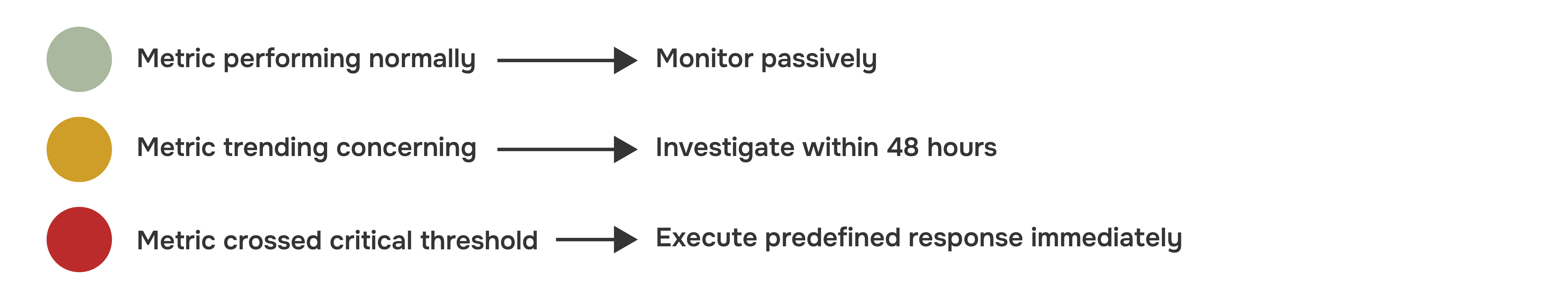
A logistics company for instance trying to implement this for delivery performance. When on-time delivery rates drop into yellow zone (below 94%), regional operations teams investigate root causes within two days. When rates hit red zone (below 90%), the system automatically reroute shipments to backup carriers without requiring approval. This protocol-based response cut average recovery time from 12 days to 3 days.
4. Ensuring Decisions Are Empowered, Not Escalated Endlessly
Traditional governance structures large committees, consensus-driven decision-making, are incompatible with data-driven operations. Organizations need lean governance models where authority is delegated to the decision level, not the approval level.
We advocate for "decision rights mapping": explicitly documenting which decisions can be made by which roles at what data confidence thresholds. A pricing manager might have authority to adjust prices +/- 5% based on demand signals without approval, but changes beyond that threshold require executive sign-off. This clarity eliminates the bottleneck where every data-informed decision becomes a discussion rather than an action.
This demonstrates that decision-centric workflows require centralized business logic to ensure consistency, but decentralized authority to enable speed (Cube.dev, 2025). The semantic layer governs what metrics mean; organizational design governs who can act on them.
5. Decisions Improving Over Time
Decision systems must be designed to learn. This means tracking not just whether decisions were made, but whether they achieved intended outcomes. Did reallocating marketing budget improve CAC? Did adjusting credit risk appetite impact profitability? Without this feedback loop, organizations repeat decisions that don't work.
We build "decision performance dashboards" (note: these are for decisions, not instead of decisions) that track decision quality metrics: speed of response, accuracy of predictions, impact on outcomes. A consumer goods company tracks every inventory allocation decision, what was predicted, what was decided, what actually happened. Over 18 months, their demand forecast accuracy will improve from 67% to 89%, not through better algorithms but through systematic learning about when human judgment should override model recommendations.
Table 1: Reporting to Execution
The Path Forward
The organizations that win over the next decade won't be those with the most dashboards or the most sophisticated analytics, they will be those that architect decision systems where insights automatically trigger appropriate responses.
This requires a fundamental shift in how we think about analytics investments:

At Pacepoint, we help clients make this transition by treating analytics as strategic infrastructure, not technical capability. We map critical decisions, define triggers and thresholds, embed insights in workflows, and build governance models that enable speed without sacrificing control. The goal is not better dashboards, it's faster, smarter decisions that compound competitive advantage over time.
The measure of an effective analytics system is not how many metrics you track or how beautiful your visualizations are. It's how quickly insight converts to action, and how consistently those actions improve outcomes. Everything else is performance art.
Data does not transform organizations. Decisions do, and only when systems are designed to support them.
References
- Cube.dev. (2025, January 12). The future of data workflows isn't dashboards. It's decisions. Retrieved from https://cube.dev/blog/the-future-of-data-workflows-isnt-dashboards-its-decisions
- Cube.dev. (2025, May 1). Why your data strategy needs more than a warehouse for confident decisions. Retrieved from https://cube.dev/blog/why-your-data-strategy-needs-more-than-a-warehouse-for-confident-decisions
- Cube.dev. (2025, April 24). Fromdata chaos to data clarity: How Cube Cloud empowers decision-makers with trustworthy insights. Retrieved from https://cube.dev/blog/from-data-chaos-to-data-clarity-how-cube-cloud-empowers-decision-makers-with
- Fisk, S. (2022, April 1). Datadashboards are like car dashboards: They should give a quick/simple insight into what's going on [LinkedIn post]. Retrieved from https://www.linkedin.com/posts/selenafisk_leading-with-data-in-schools-activity-6915611728663764993-UOse
- Sigma Computing. (2025). You don't need more data—you need the right data sources. Retrieved from https://www.sigmacomputing.com/blog/data-sources